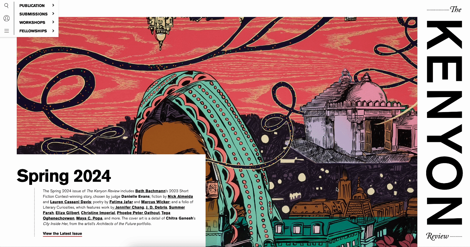
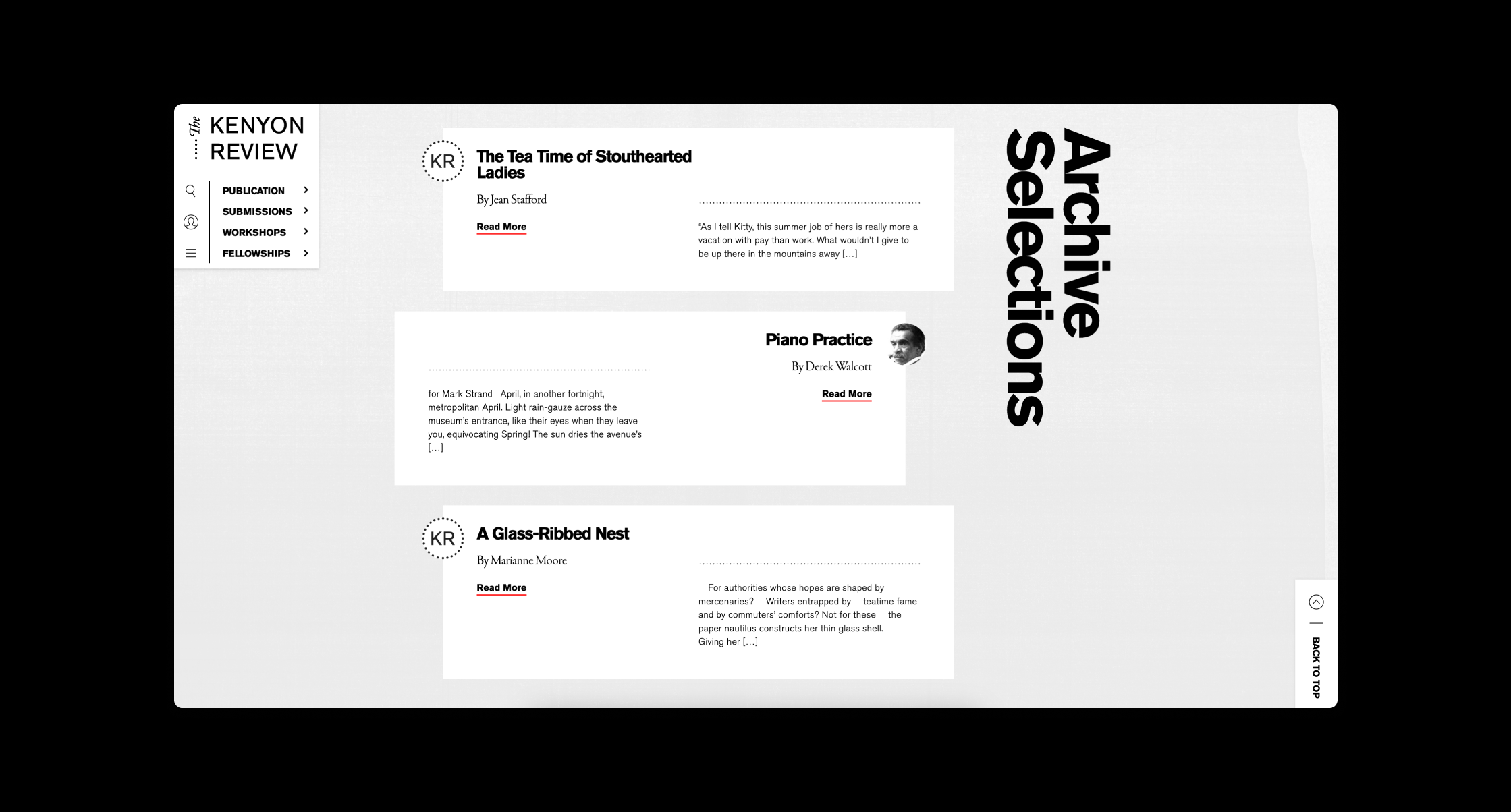
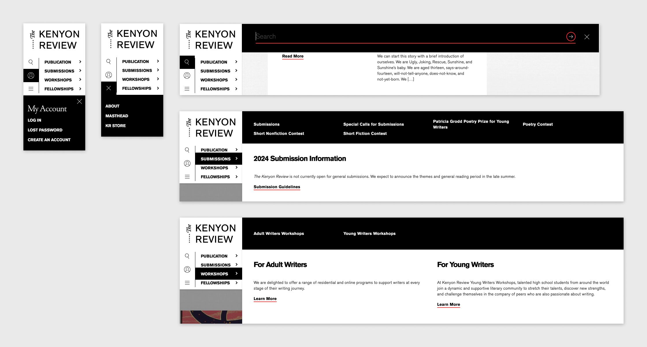
The Kenyon Review is ‘an international journal of literature, culture, and the arts’ that releases a few publications a year, featuring various authors/poets and their works. At CMYK we were asked to come up with a new visual system and website, using only their logo as an existing brand mark. Because their previous website featured no photography other than issue covers, I wanted to highlight these issue covers and use them as a textural element on the site. As the user scrolls, the current issue cover serves as the background in a parallax effect in some form on every page. Aside from this, using subtle paper & grain textures on a light grey background helps bring some depth to a mostly black and white website. Lastly, we wanted to create an unusual yet tactical navigation where the user can get any link they need from a persistant block on the top left corner.